
Mobile Responsive Web Design Services
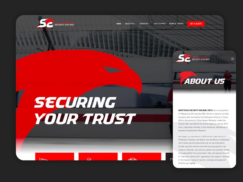
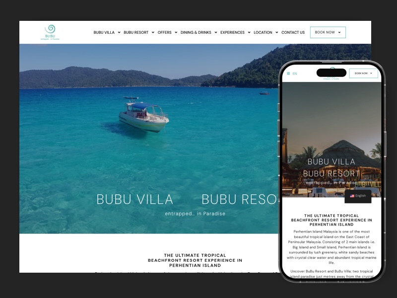
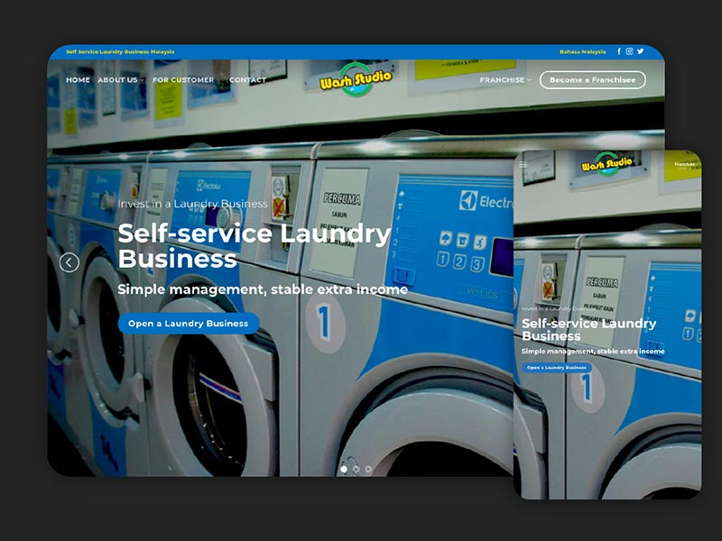
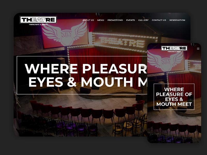
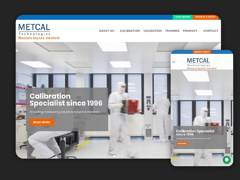
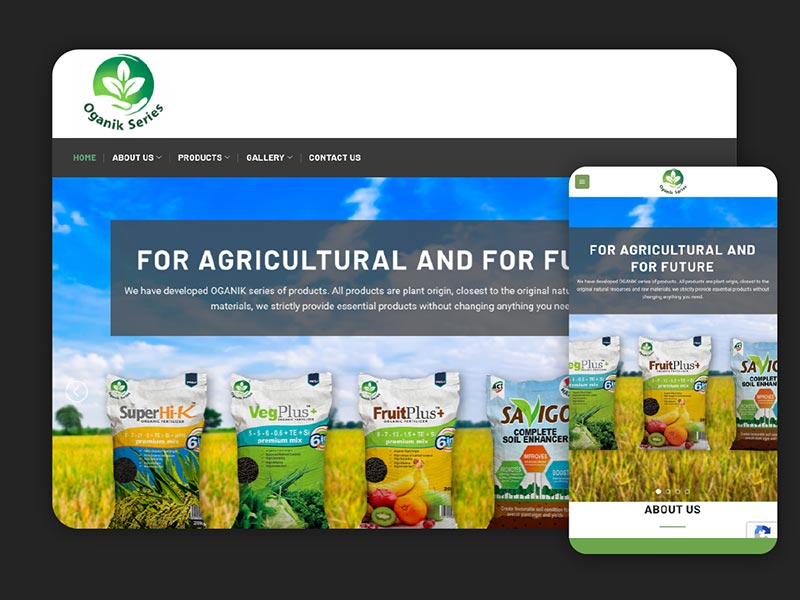
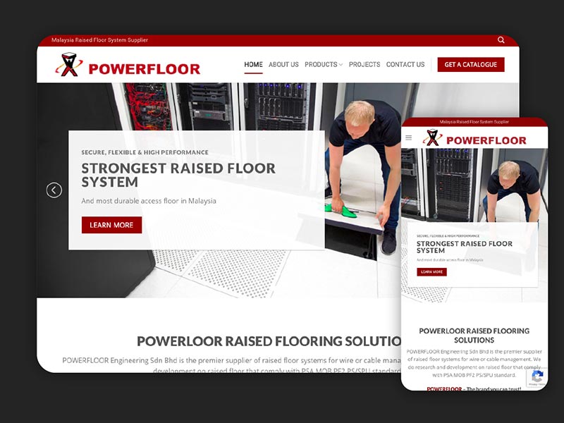
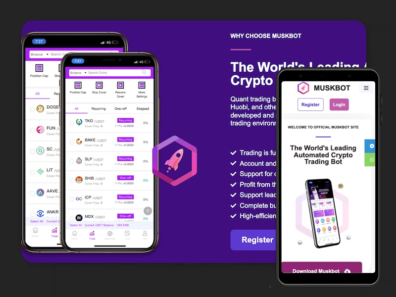
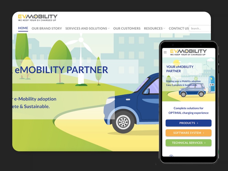
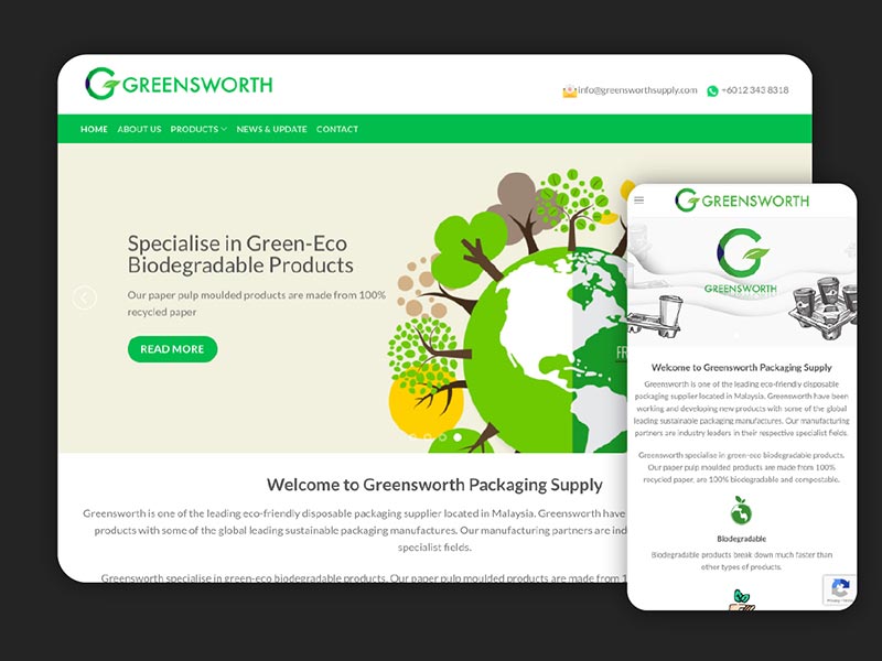
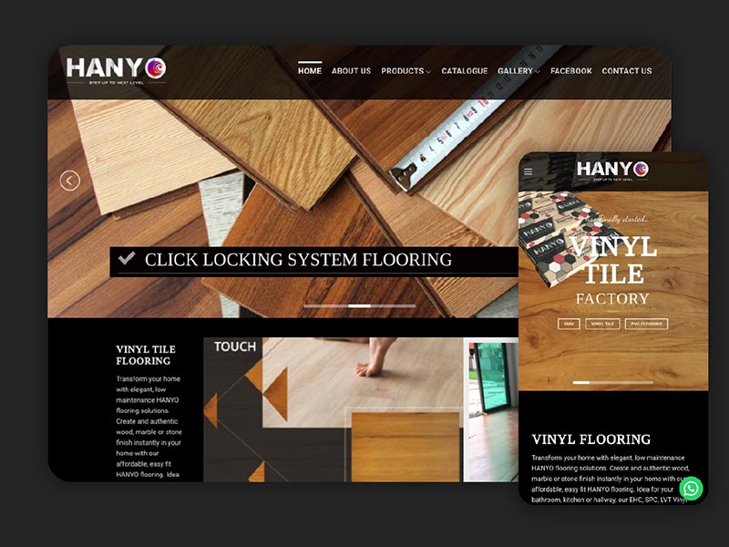
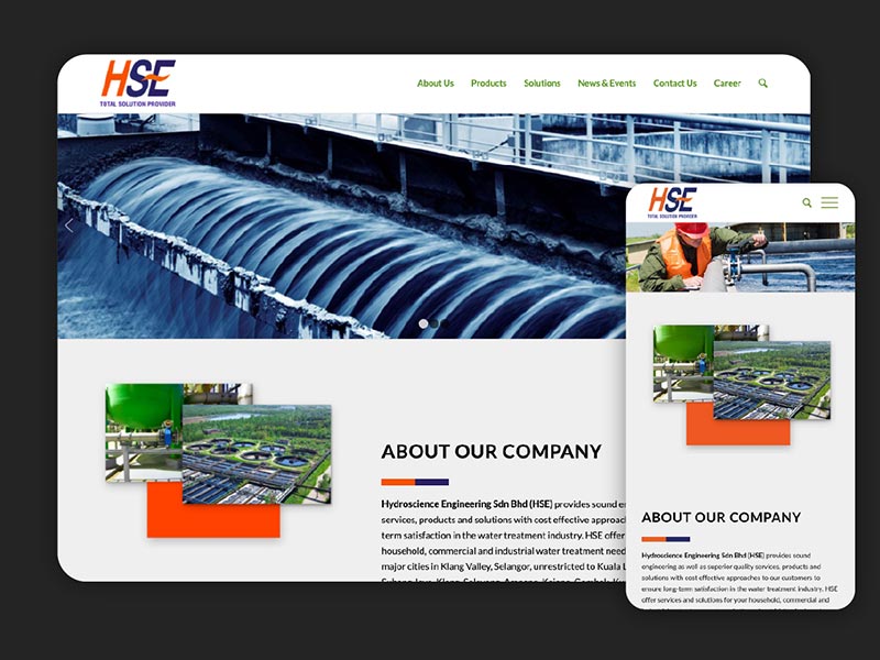
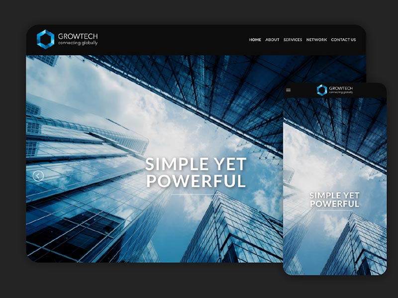
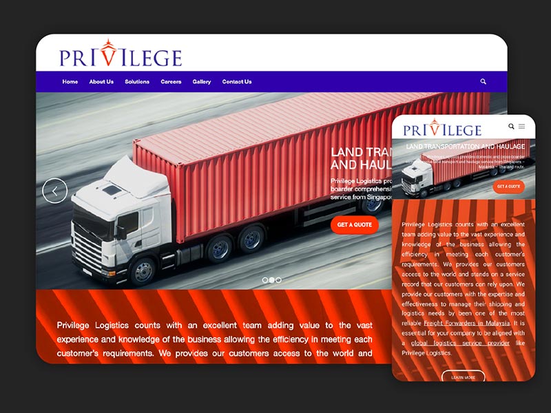
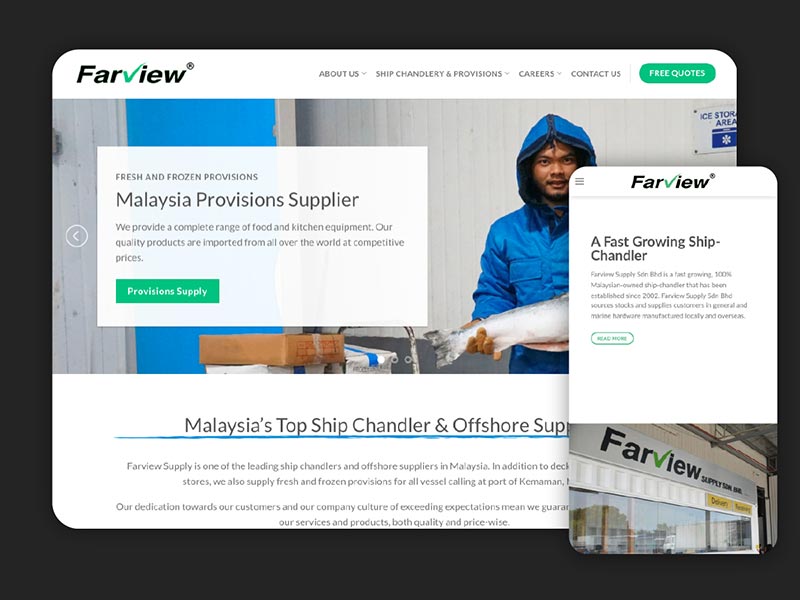
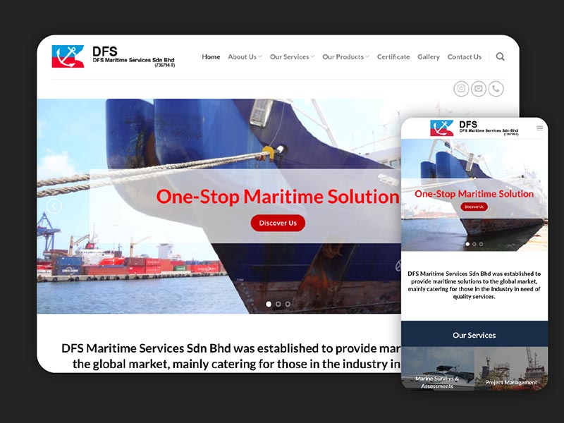
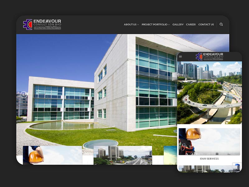
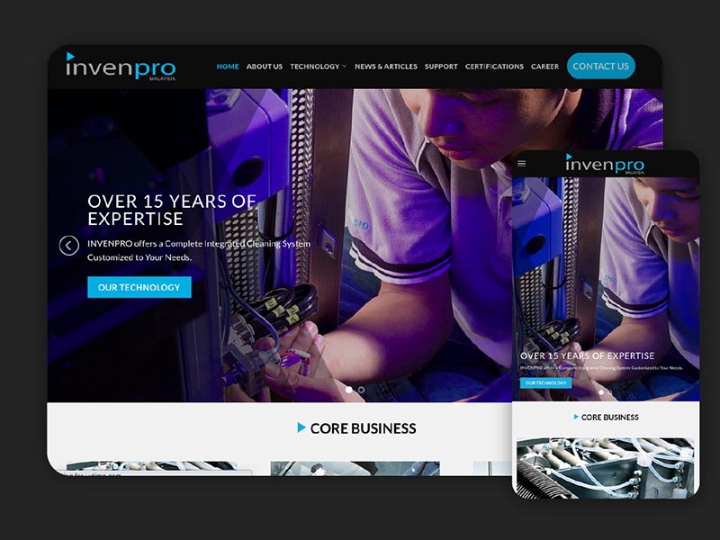
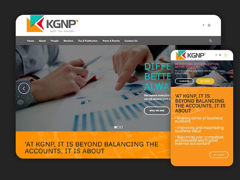
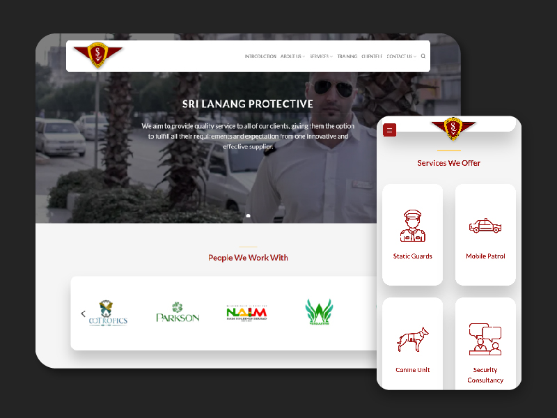
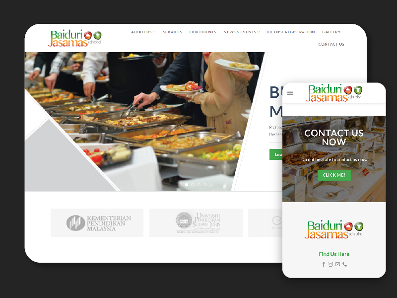
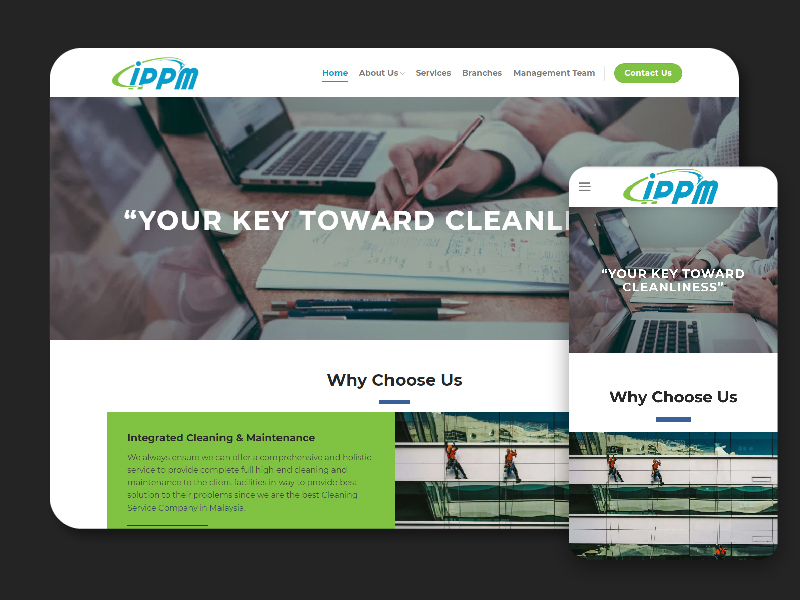
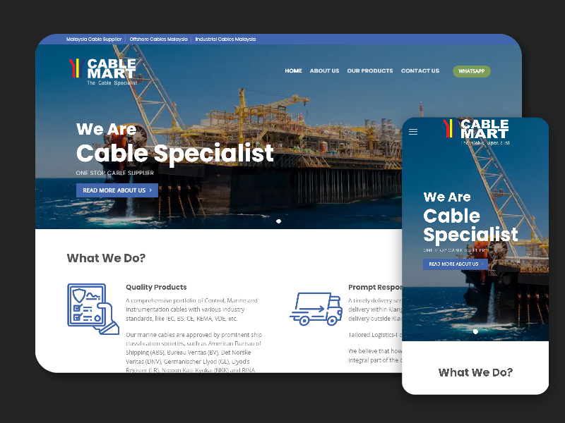
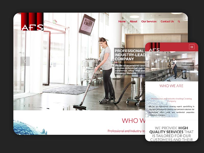
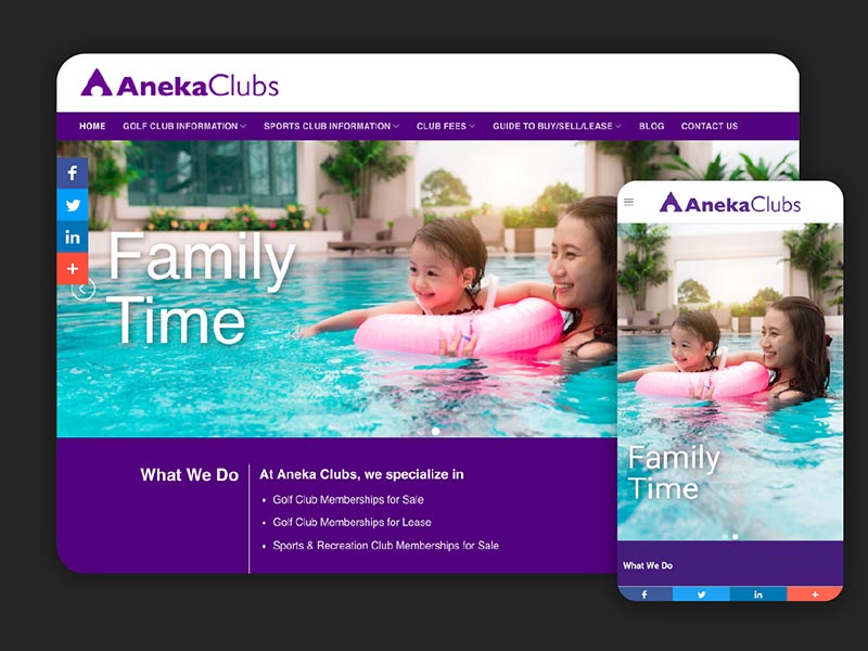
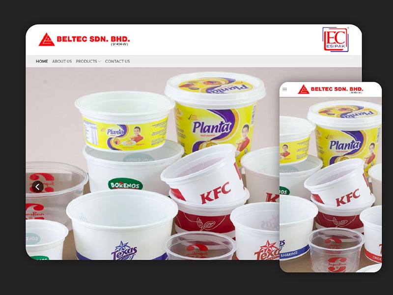
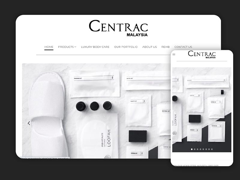
JustSimple is one of the first web firms in Malaysia to join the responsive web design revolution. Responsive design means your website automatically adjusts to fit the size of whatever window or device visitors are using. Responsive design is recommended by Google as best practice for mobile-optimised websites.


Try it out now: resize this browser window and see how it changes! Or look at our site on your iPhone or iPad.
We design your website to work on all devices, from mobile phones and tablets to desktops and large screens.
Responsive design is available from JustSimple for any website project. This means that your site can be mobile-ready and tablet-ready without the need to build expensive, customised designs for each device.
We offer responsive web design to businesses and organisations in Kuala Lumpur, Petaling Jaya and throughout Malaysia.